

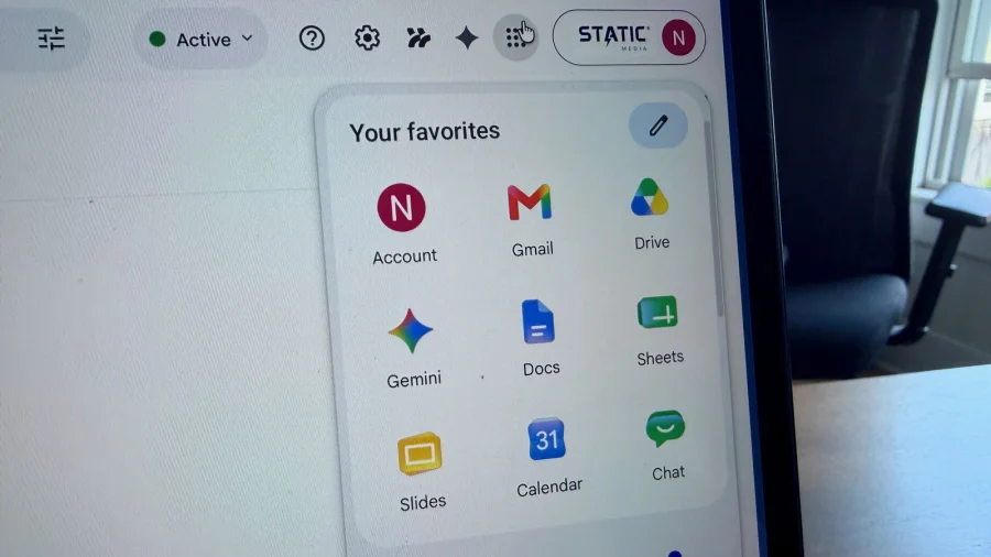

Google apne app icons ko upgrade kar raha hai. Naye icons ab roll out ho rahe hain. Yeh un purane icons ka replacement hai jo 5 saal pehle aaye the.
Purane icons mein kya problem thi?
Original story ke mutabiq, purane icons mein visually differentiate karne ki bahut kami thi. Matlab, alag-alag apps ke icons ek jaise lagte the. Isse users ko app dhundhne mein problem hoti thi.
Naye icons mein kya badla?
Naye icons ko "much-improved" bataya gaya hai. Iska matlab hai ki ab icons mein zyada visual difference hoga. Har app ka icon ab unique lagega. Yeh change users ke liye helpful hoga.
Hamaari Baat: Yeh change kyun important hai?
Seedha baat karein toh, app icons ka design chhota lagta hai lekin user experience mein bada farak padta hai. Jab aap rozana dozens of apps use karte hain, toh visually distinct icons se time bachta hai. Google ne 5 saal baad yeh realize kiya ki purane icons kaam nahi kar rahe. Naye icons ke saath, users ko better experience milega. Yeh ek positive step hai.
Sources & References
- Google's much-improved app icons are rolling out now — Original Story